In the 80s, many brands were trying to find ways to stand out from the crowd by using logos that stood out. This was especially true for corporate logos and more so for companies. It was also fairly used by bands.
For brands, logo designs were very important in establishing a visual identity that would help them create a memorable experience with their audience. The most common changes were focused on the font and format of those, some of which are still found in use today. They often followed a colorful, “new wave” sort of style, with blocky fonts that reflected the trend of arcade games and bold pop stars.
Here are some of the most familiar logos found in the 1980s:
The Nintendo Logo
Historically, Nintendo has been the pillar that shaped the gaming industry. In 1889, Nintendo started manufacturing playing cards. Since that time, they have changed dozens of logos and brand identities. A very notable Nintendo logo that had existed would be the one from 1983. They also wrote the name of the company in bold red font, along with an elliptic line around the name in the same color.
That is the logo of this company. That company became popular for making video games in the 80s and 90s. That logo was still being used until 2008 when the managers decided to change the shape and replace the red color with gray. Despite its simplicity, it represented the playfulness of arcade and console games well. It has been the prime game company choice for many generations of children, whether they’re born in the 80s or even the 2000s.
The Apple Logo
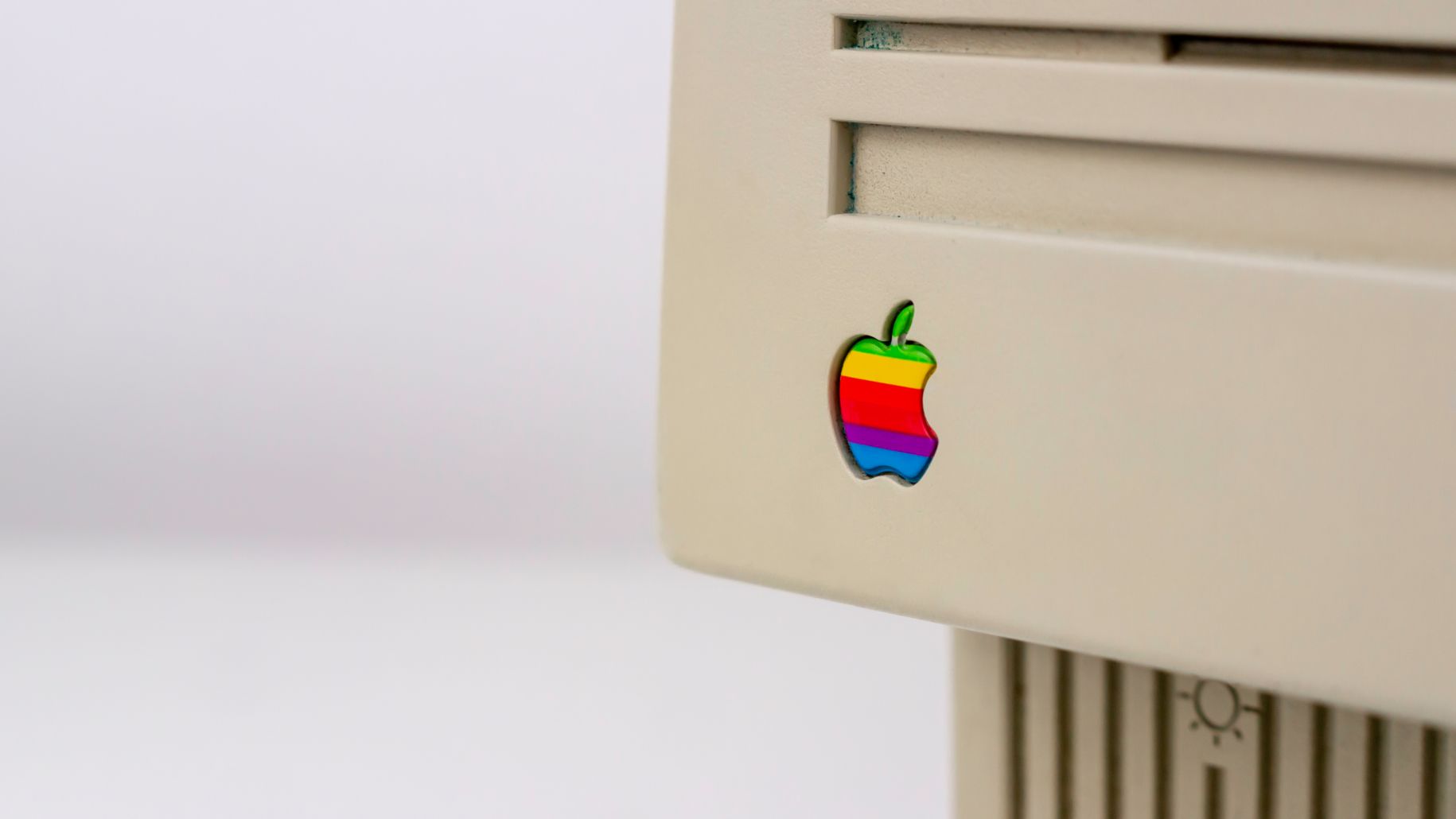
A company that is one of the most powerful companies in the world started searching for a large market in the 1980s. One of the first logos for Apple, Inc. included an illustration of Isaac Newton sitting under an apple tree. That logo was created in 1976.
That next year, Steve Jobs and Steve Wozniak decided to come up with a new name for the company. That is when the famous apple logo was made, consisting of an apple with a single bite on it. Originally, it also had the company name written on the logo.
In 1998, the only change that was made was that the color was changed, and the name of the company was also changed. As for the logo that they now use, it is based on the original 1984 logo, except it is without colors.
McDonald’s Golden Arches
McDonald’s Golden Arches are easily recognizable all over the world thanks to their bright yellow color scheme that makes them stand out from other logos in the 80s. They have been around since 1955, but it wasn’t until 1962 when they started using the golden arches as part of their logo.
The arches symbolized how early versions of the restaurants often featured archways. It was then incorporated into the logo of the restaurant chain as a part of the “M” in the name “McDonald’s.”
